

New Leaked Pokémon promos are FULL game references
The newest layered Pokémon promo cards have turned up and these are really those cards that only get better the longer you look at them. Discover the Pokemon First Partner pack series 2 Illustration Rare promos with us!
Maybe I'm also a little bit biased here, because Gen 2 remains personally the generation. That's where Pokémon really started for me and as a Feraligatr collector I'm really completely sold by that Totodile IR promo.
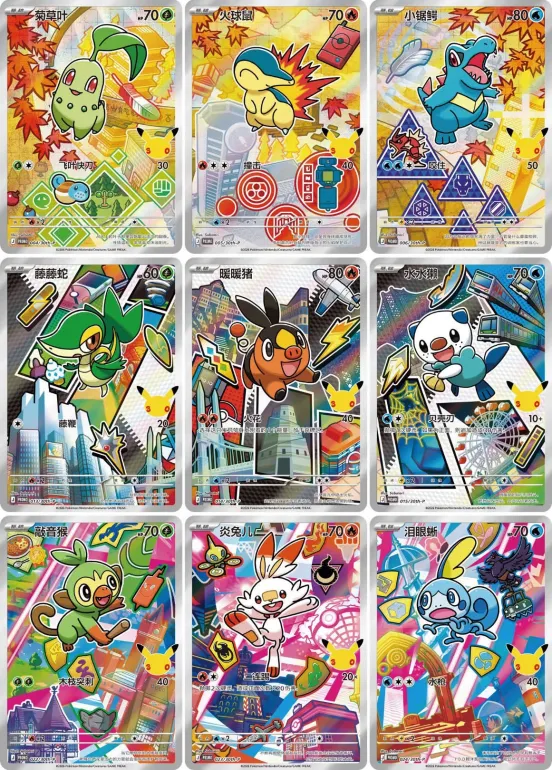
At first glance, it seems especially cheerful, busy artwork cards with starter Pokémon from different generations. But the longer you look, the more small details, references and hidden easter eggs you begin to spot.
It really feels like the illustrators have challenged themselves to put as many game references as possible into these artworks.
You notice that they have tried to give each generation a complete identity in these artworks. Not only in terms of color usage, but also through buildings, items, symbols, iconic locations and game references
Some cards have so many details that you almost forgot it's about promos.
Community is already searching for references
As always with this kind of leaks, the community is already zooming in on every pixel of these cards.
People have been mocking everything. Goldenrod Radio Tower, Pokégear menus, Whirl Islands, Rainbow Wing, Silver Wing, Sudowoodo, Johto route map elements... and probably we're still missing a lot.
That's what makes these promotional candidates so much fun. It's almost like a scavenger hunt for people who used to be all in those games (like me)
First community responses
Within the Stockmonster community we already see quite a bit of enthusiasm emerging around these promotional products.
Especially the amount of hidden details and the unique art styles are often mentioned. Some collectors even compare the feeling to older Japanese promo series where each card really had its own identity.
At the same time, there are also people who indicate that the maps may be . Especially with the Galar starters some collectors see so many colors and effects that it becomes almost overwhelming. But this was also the case with the previous first pack promo , where in particular gene 1 really has become an already iconic set of cards.
But maybe that's why these cards trigger so many reactions.
They feel different and evoke the urge to eventually collect all 9 starters. I really feel like people are going to look back on this bizarrely nostalgic.

What other Easter eggs did you find?
From Johto's nostalgia to the modern chaos of Galar, these promos feel almost like a celebration of the games themselves.
And the longer you look, the more details you discover.
What other references are you mocking?
Do we miss certain gym references, city references or callbacks to specific moments from the games?
And what map do you think is strongest in the end?


